HWAPAMA
Huambo · AngolaNumbers & Facts
Country: Angola
City: Huambo
Client: HWAPAMA
Year: 2026
Status: Project
Theme: Graphic design
Program: Branding
Credits
Graphic Design Team: TEKSTUDIO. Bruna Serralheiro
HWAPAMA is a company that distributes building materials and cement products, based in Huambo, Angola. The name comes from Umbundu, the language spoken in the region, and means “strength”. Since the company’s main business is selling cement, the name speaks directly to the quality that defines the product: strength, resistance and durability.
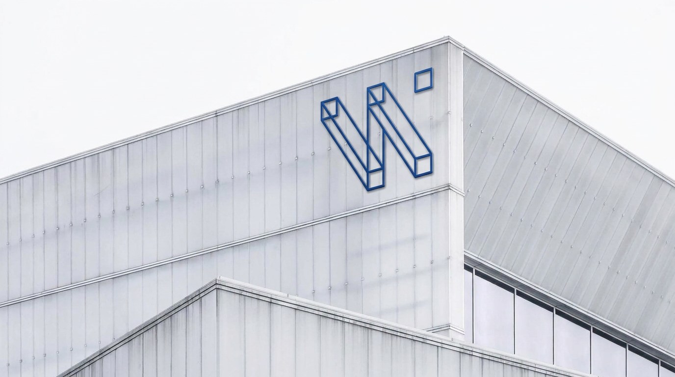
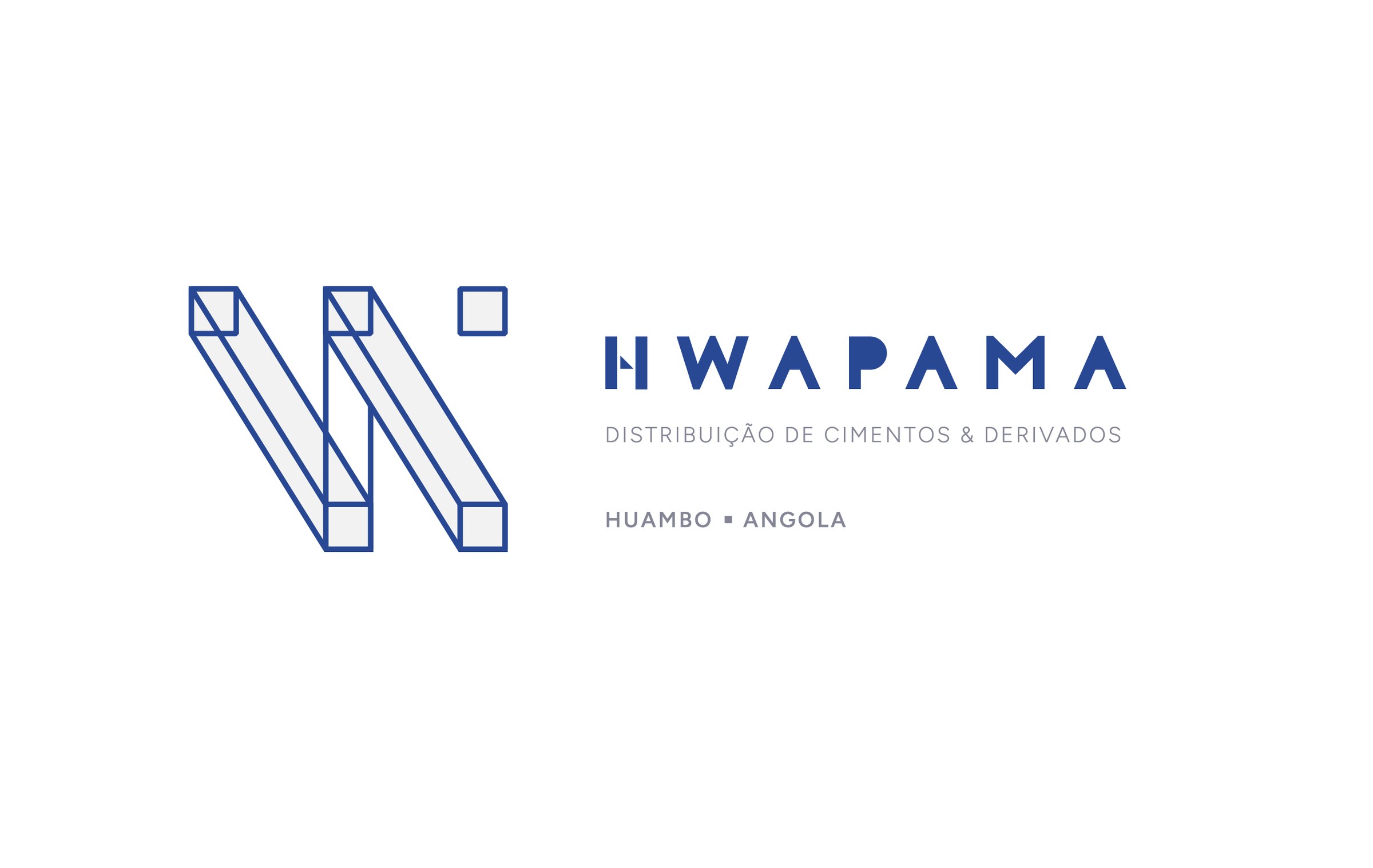
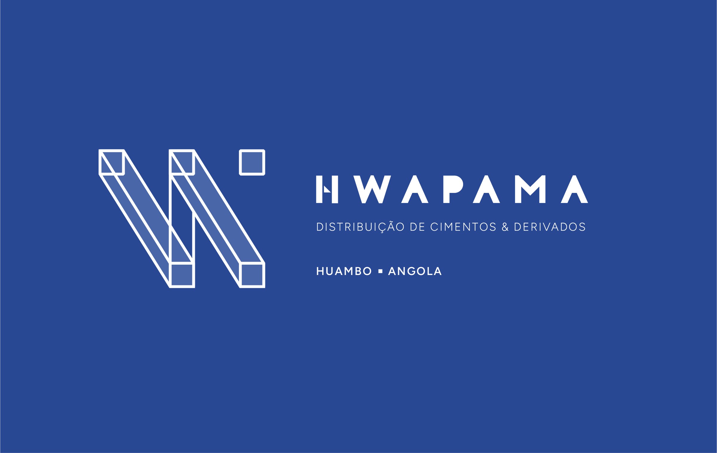
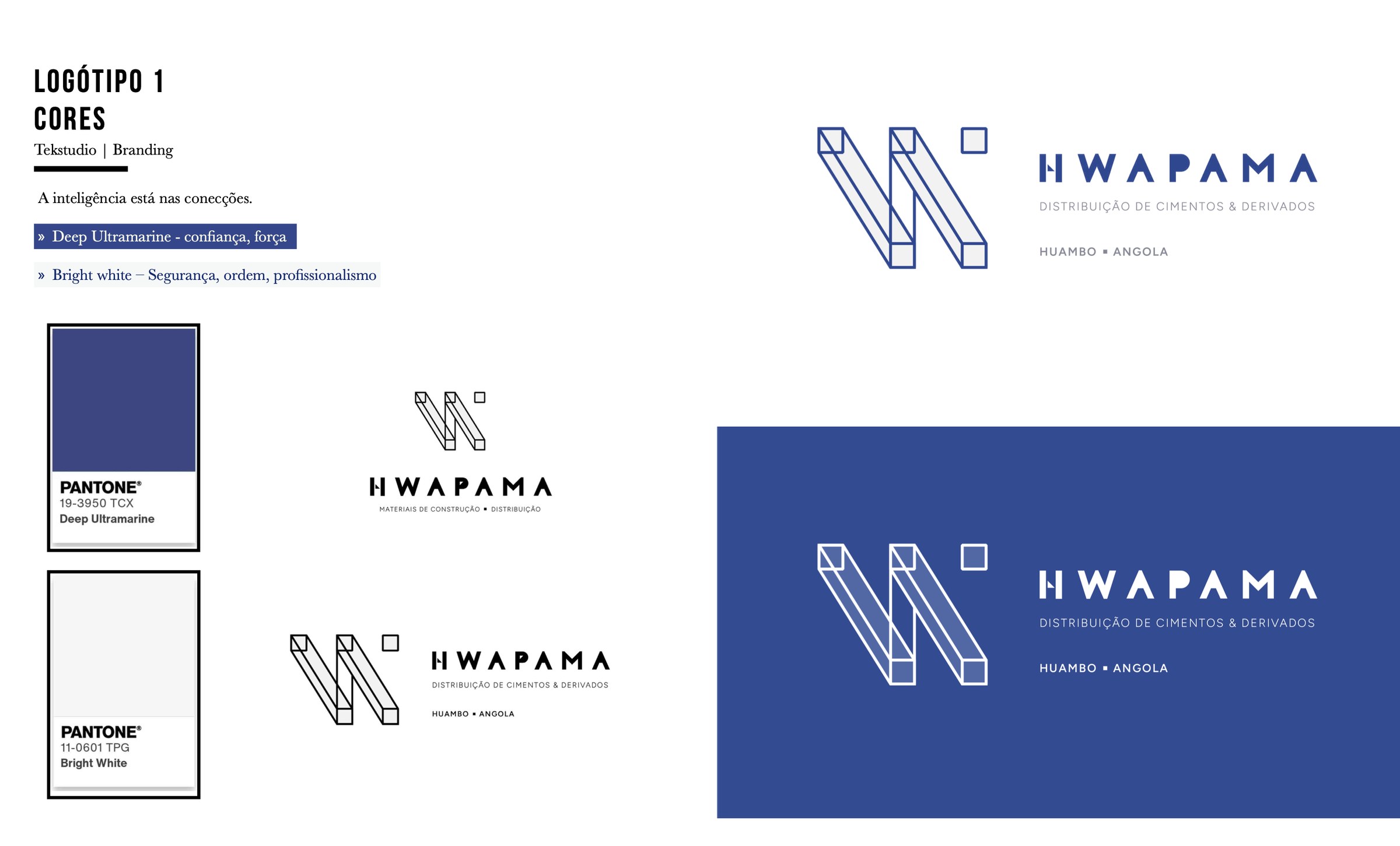
The symbol translates this idea into the language of construction. Two beams drawn in isometric perspective build the letter W, and a small square block completes the composition. Structure, load and connection can be read at a single glance: the intelligence lies in the connections.
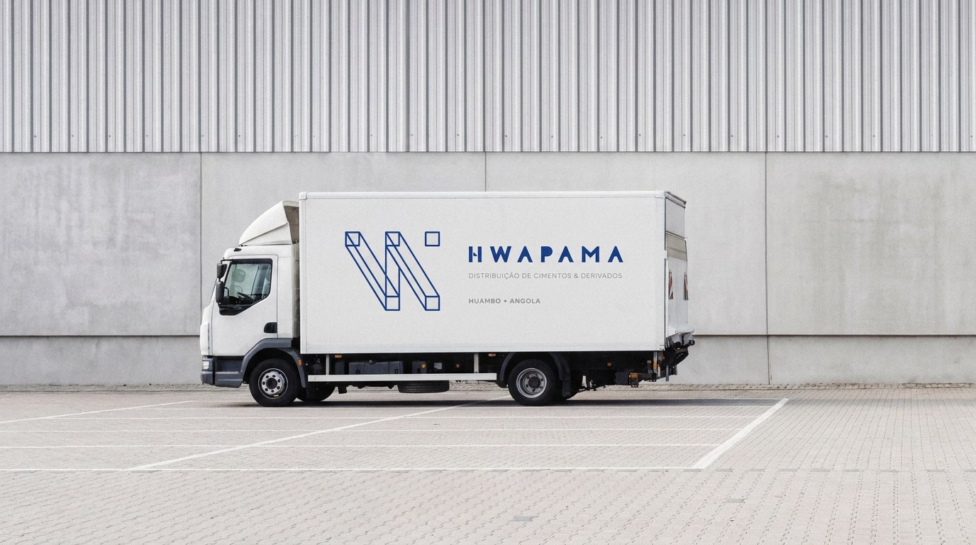
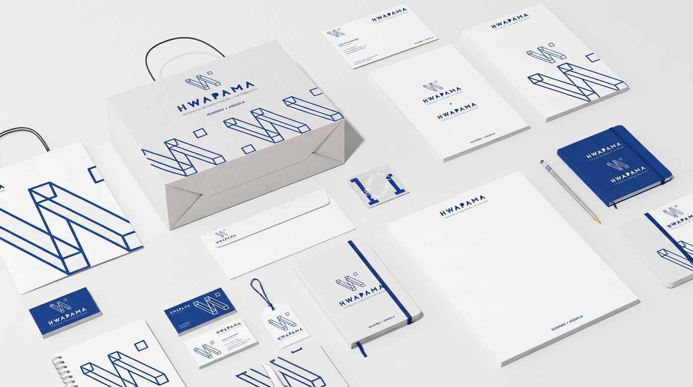
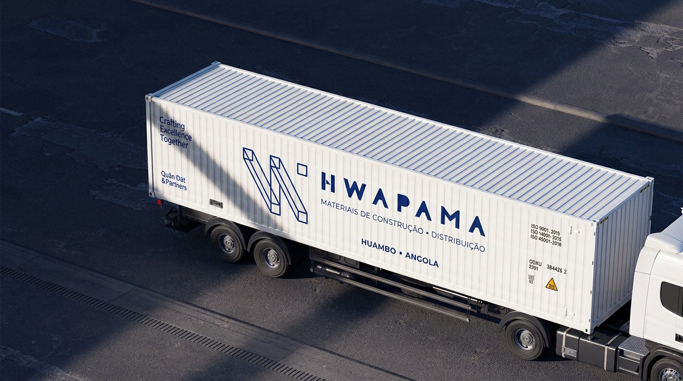
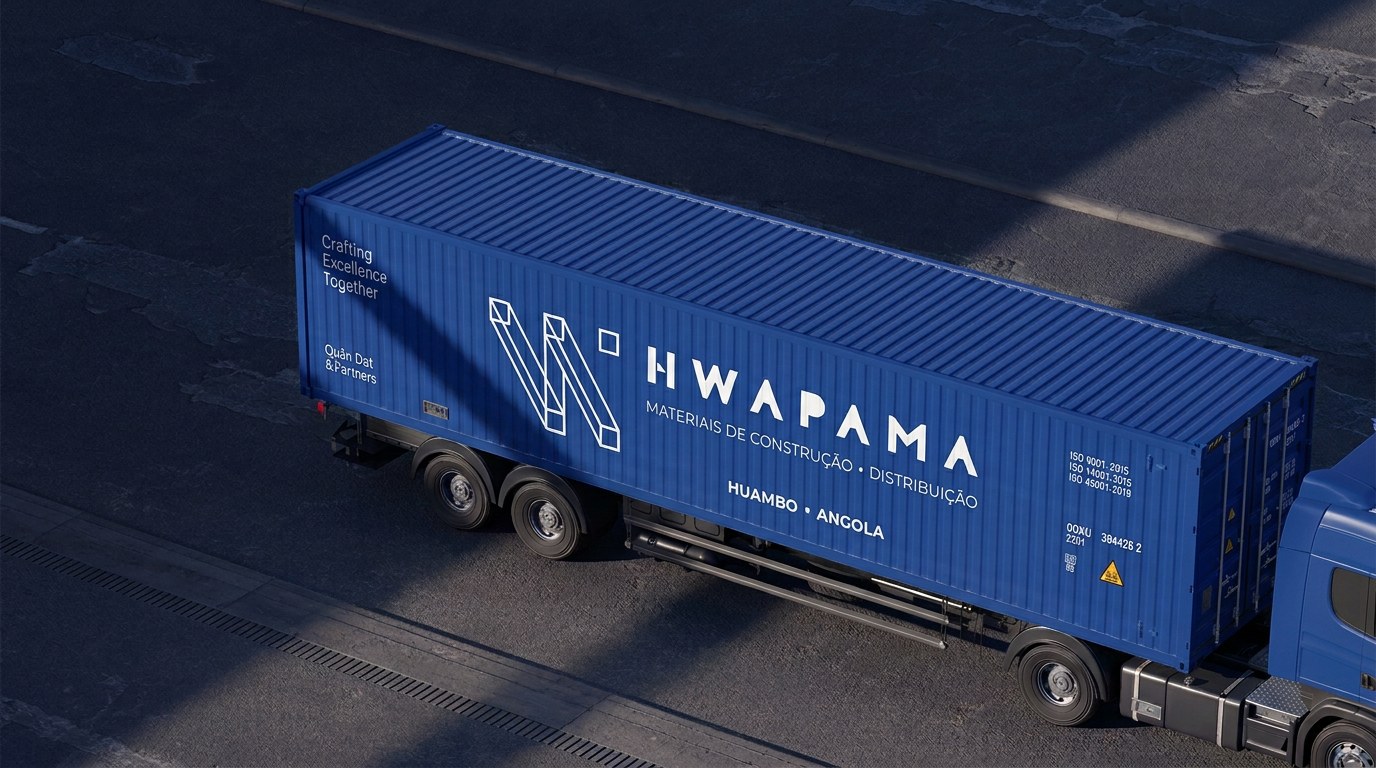
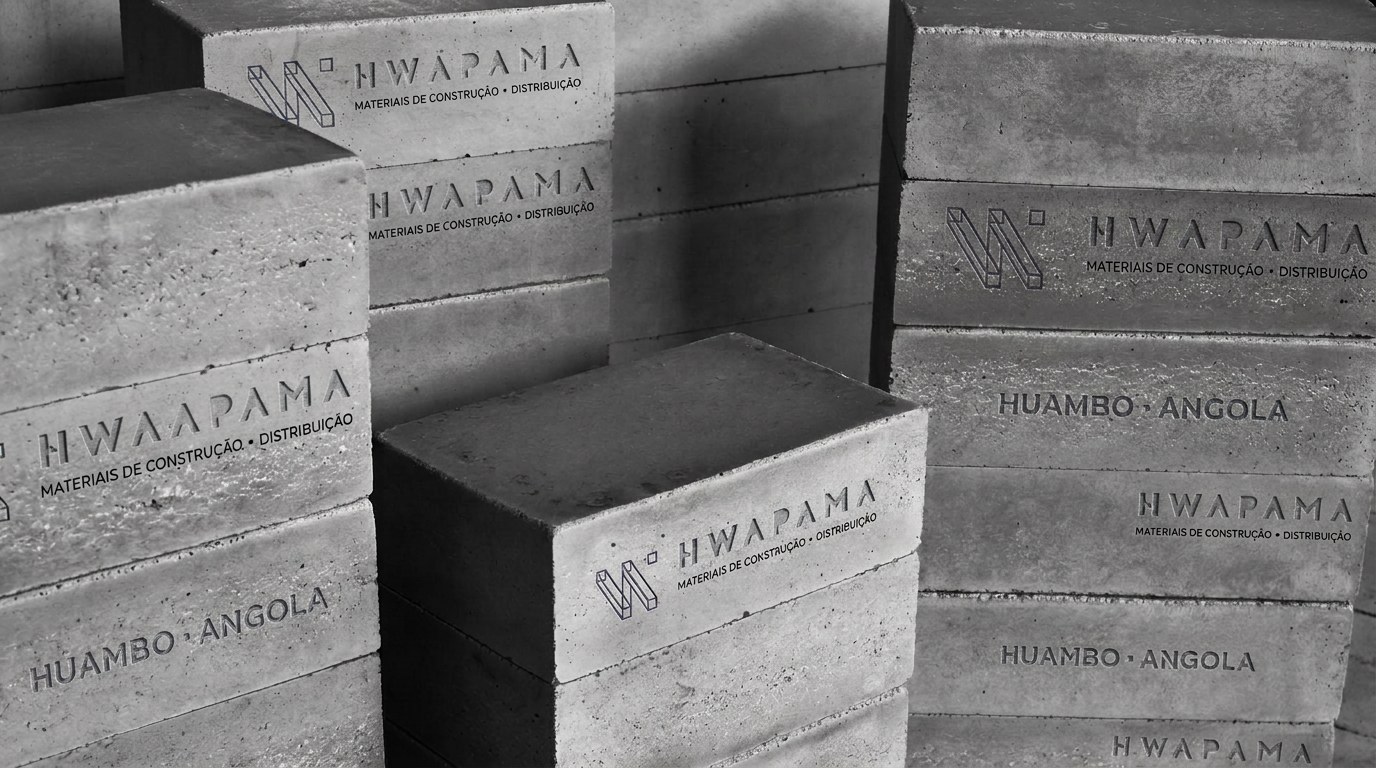
The palette is reduced to two colours: Deep Ultramarine, which conveys trust and strength, and Bright White, associated with safety, order and professionalism. The identity was designed to work at every scale, from stationery and business cards to delivery trucks, shipping containers and building façades, and even on the concrete blocks themselves, where the logo is engraved directly onto the product.