Regal
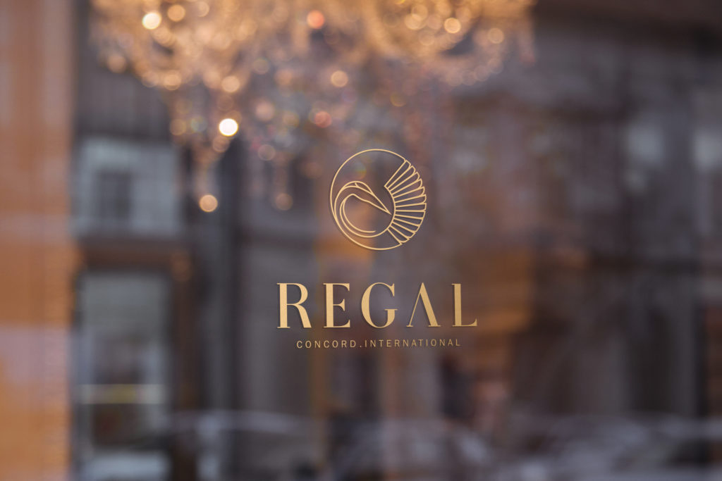
Regal InternationalBrandingRegal InternationalBranding Previous slide Next slide Numbers & Facts Location: China Client: Regal Concord International Year: 2018 Status: Project Theme: Graphic Desgin Program: Logo, branding, stationary, Hospitaly Credits Graphic Design Team: Bruna Serralheiro, Vera Nunes The logo for Regal Concord International, a premier chain of five-star hotels in China, elegantly embodies the essence of timeless sophistication. Drawing inspiration from the Red-crowned Crane—an emblem of grace and longevity—the design features a refined blend of terracotta and imperial jade tones. These colors reflect the historical majesty of the Terracotta Army and the serene elegance of jade, harmonizing traditional Chinese heritage with modern luxury. This logo represents Regal Concord International’s commitment to offering a distinguished and unforgettable experience, seamlessly integrating cultural richness with contemporary sophistication across its Chinese properties. Related projects Mukitixi brand Read More LBS ALUMNI FOOTBALL CLUB | BRANDING Read More Fabric Read More Espaço Africa Read More Banco Credisul Read More Africa prime Read More
Fabric
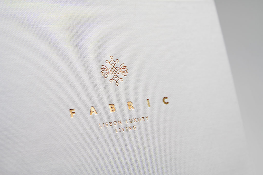
FabricBrandingFabricBrandingFabricBranding Previous slide Next slide Numbers & Facts Location: Portugal Client: Fabric Year: 2018 Status: Built Theme: Graphic Desgin Program: Logo, branding, stationary Credits Graphic Design Team: Bruna Serralheiro, Vera Nunes Fabric, located in the heart of Rossio, Lisbon, is a brand that embodies luxury living with a rich historical twist. The name Fabric is a homage to the building’s origins as a textile factory, weaving a narrative that combines past and present. The branding of Fabric emphasizes elegance, exclusivity, and a deep respect for its heritage. By integrating the building’s industrial past with contemporary design, Fabric offers a unique living experience that honors its history while providing modern sophistication. Each residence is meticulously crafted with high-end finishes, state-of-the-art amenities, and expansive views of Lisbon’s iconic skyline. Fabric stands out as a symbol of refined urban living, deeply connected to the cultural richness of its surroundings. Related projects Mukitixi brand Read More LBS ALUMNI FOOTBALL CLUB | BRANDING Read More Espaço Africa Read More Banco Credisul Read More Africa prime Read More
LBS ALUMNI FOOTBALL CLUB | BRANDING
LBS Alumni Football ClubLondon Business School Numbers & Facts Location: United Kingdom City: London Client:LBS ALUMNI FOOTBALL CLUB Year: 2015 Status: Project Theme: Graphic design Program: Branding Credits Architecture Team: Bruna Serralheiro, Catarina Pinto The London Business School Alumni Football Club’s brand’s renovation intends to be a contemporary, sophisticated and minimalist. Symbol of strength and power, the Lyon is frequently associated with football. The chosen colours of purple, gold and grey emphasize the idea of exclusivity wanted by the client. Related projects Mukitixi brand Read More Espaço Africa Read More Banco Credisul Read More Africa prime Read More
Mukitixi brand
Mukitixi BrandHotel brandingMukitixi BrandHotel branding Previous slide Next slide Numbers & Facts Location: Angola City: Kibala Client: Mikitixi Year: 2015 Status: Project Theme: Graphic design Program: Hotel brand Credits Architecture Team: Bruna Serralheiro, Catarina Pinto The proposal for the logo of Mukitixi Lodge in Kibala, Angola was simultaneous to the architecture project. Taking as starting point the letter “M”, the shape assumes a tribal pattern, inspired by the native tribes of the area, and takes as reference the architectural typologies of the project, which reinterpret typical thatched cottages. Related projects LBS ALUMNI FOOTBALL CLUB | BRANDING Read More Espaço Africa Read More Banco Credisul Read More Africa prime Read More
Espaço Africa
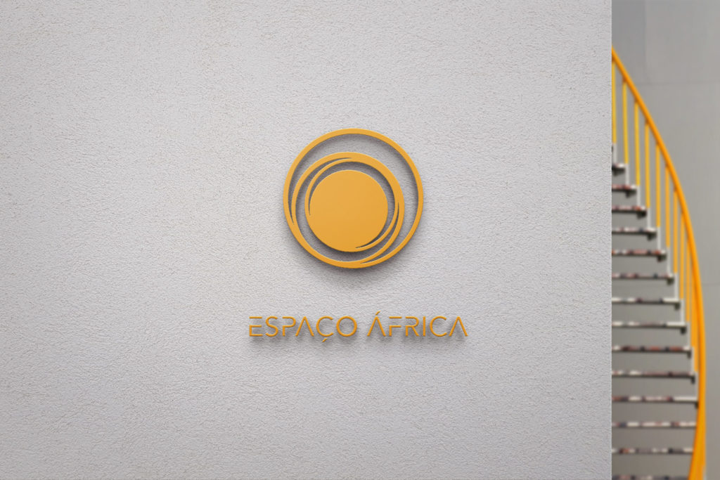
Espaço AfricaBranding Numbers & Facts Location: Angola Client:Espaço Africa Year: 2015 Status: Implemented Theme: Graphic design Program: Branding Credits Architecture Team: Bruna Serralheiro, Catarina Pinto The new logo for Espaço África came from the client’s will to renovate his Real Estate company’s image. In order to turn the logo more current we kept it simple and minimal while preserving the precedent circular form, inspired by the African sun. We also proposed a different typography and turned the red from before to yellow and orange, symbolizing vitality, prosperity and success. Related projects Mukitixi brand Read More LBS ALUMNI FOOTBALL CLUB | BRANDING Read More Banco Credisul Read More Africa prime Read More
Africa prime
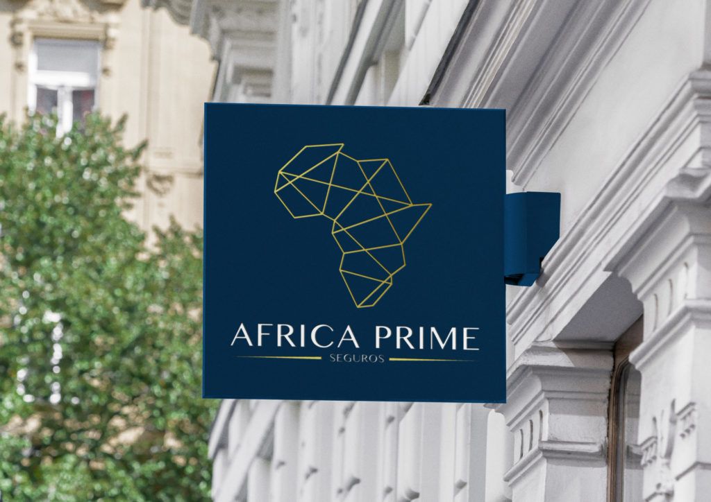
Africa PrimeBranding Numbers & Facts Location: Angola City: Luanda Client: Africa prime Year: 2014 Status: Project Theme: Graphic design, Branding Program: Branding Credits Graphic Design Team: Diogo Lima Inspired by the African continent, Africa Prime, based in Angola, Intends to highlight the company’s position in the African continent as well as reinforce the brand’s idea of confidence, stability and sophistication along its customers. Related projects Mukitixi brand Read More LBS ALUMNI FOOTBALL CLUB | BRANDING Read More Espaço Africa Read More Banco Credisul Read More
Banco Credisul
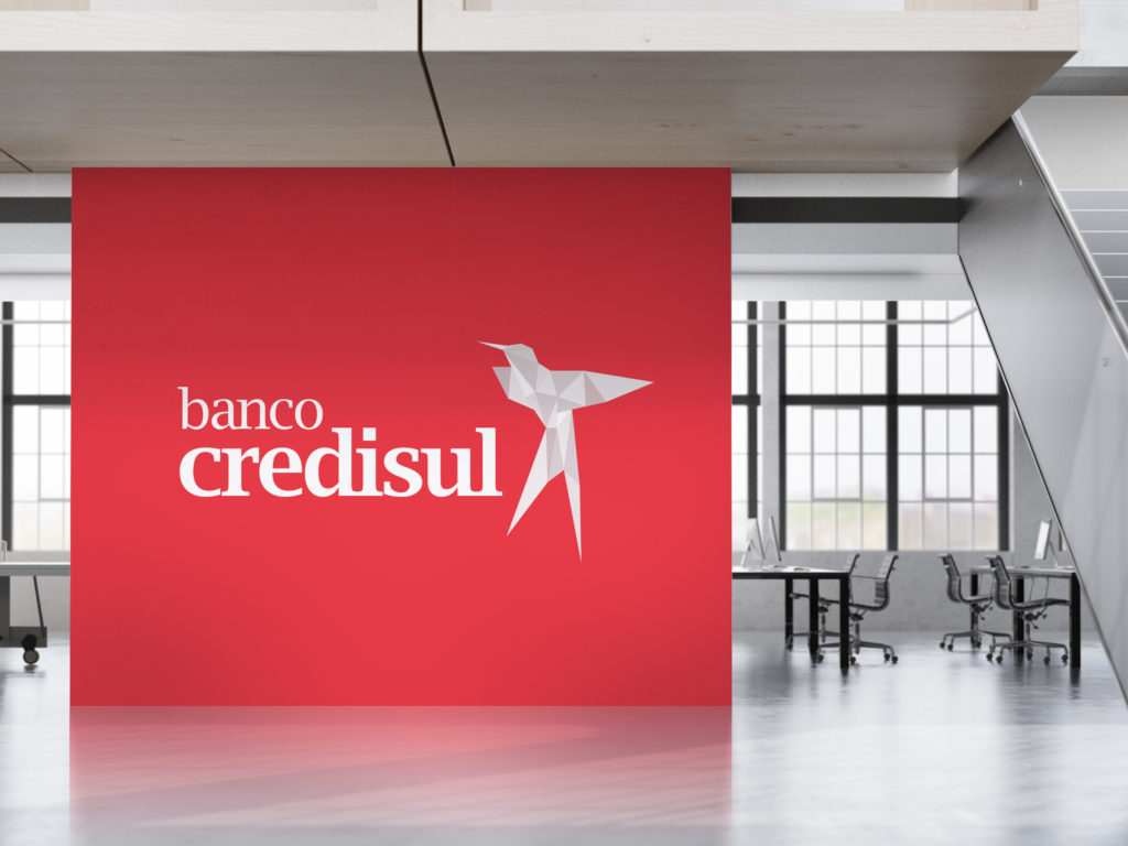
Banco CredisulBrandingBanco CredisulBranding Previous slide Next slide Numbers & Facts Location: Angola Client: Banco Credisul Year: 2014 Status: Project Theme: Graphic Desgin Program: Logo, branding, stationary Credits Graphic Design Team: Bruna Serralheiro, Catarina Pinto The Credisul Bank logo emerges from a thorough exploration of forms and shapes. The choice of the Hummingbird, commonly associated with wealth and nobility in Angola, aligns with the bank’s desire to convey these ideals to its clients. The use of the color red is apt, symbolizing leadership, trust, achievement, and sophistication. Related projects Mukitixi brand Read More LBS ALUMNI FOOTBALL CLUB | BRANDING Read More Espaço Africa Read More Africa prime Read More